July 29, 2015
Improving The Weather On Twitter
Using NWS Data To Make Animated Radar GIFs
I consume a lot of media on Twitter. My local National Weather Service branch does an incredible job on the platform, providing relevant content on everything from imminent weather events to long-term climate trends. But every once in a while, they'll tweet an image like this:
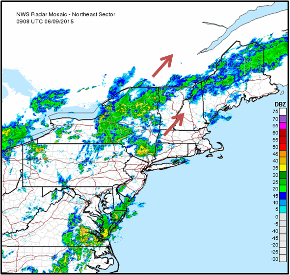
There are a few problems with this, namely:
1. There are arrows
Weather is a dynamic, complex beast that rarely moves in straight lines. Why limit ourselves to only static images?
The NWS has the data, so we should animate it.
2. The rainbow palette
The problem with the rainbow pallete is that it doesn't vary in a perceptually meaningful way. While it does increase in hue between steps—which it doesn't do evenly—its luminosity bounces all over the place, which is the most effective way to encode information using color. And if you're color-blind, good luck!
Choosing a palette is definitely tricky. The rainbow palette is both familiar and effective at showing intense storms—my eyes always go straight for the red. But we're trying to build something better, so do it in a way that is perceptually intuitive and accessible.
(Check out this excellent article to get up to speed on choosing effective palettes for visualizations. Lots of great stuff in there.)
3. That projection
Many federal agencies use the NAD83 (EPSG:4269) projection and this is the de facto projection of the National Weather Service. Unlike the palette, my preference for a different projection is more a matter of taste than science. Having grown up on the web, I'm used to Mercator, not NAD83, which makes the familar shape of the continental US look stretched out and squished to me.
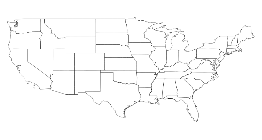
NAD-83
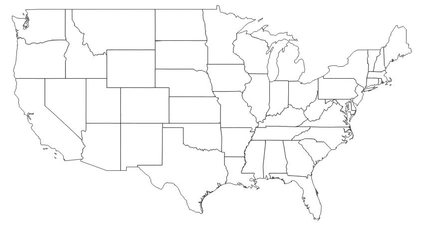
Web Mercator
Web Mercator (EPSG:3857) does a pretty good job of representing the continental US, so let's use it.
4. Again: the arrows!
In fairness to the National Weather Service, they've started tweeting GIFs recently, though there's still room for improvement. In addition to changing the palette and projection, that frame rate is pretty low.
Building Something Better
One of the wonderful things about the National Weather Service is that most of their data is publicly available. It's not accessible via some sexy API, but hey, at least it's on the web. Let's use it to build something better!
Here's what the raw NWS images look like:
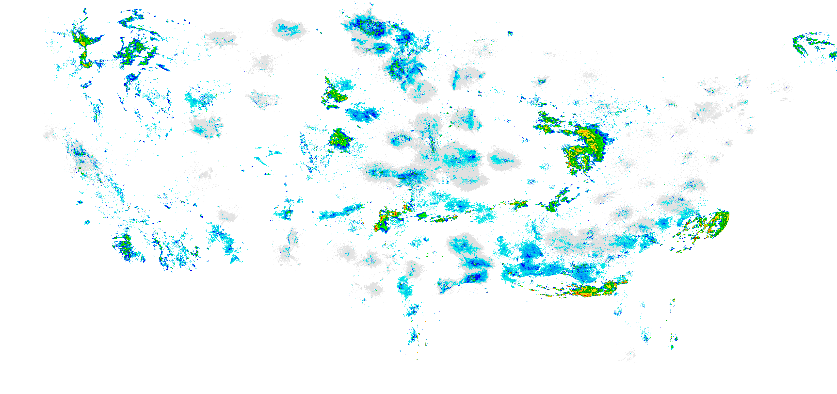
Step 1: Change The Projection
GDAL comes with a great command line utility called gdalwarp that ended up being the right tool for the job. It handles reprojections, and I was able to use os.system to execute the command in my Python script.
Here's how the NWS image is looking after reprojection:
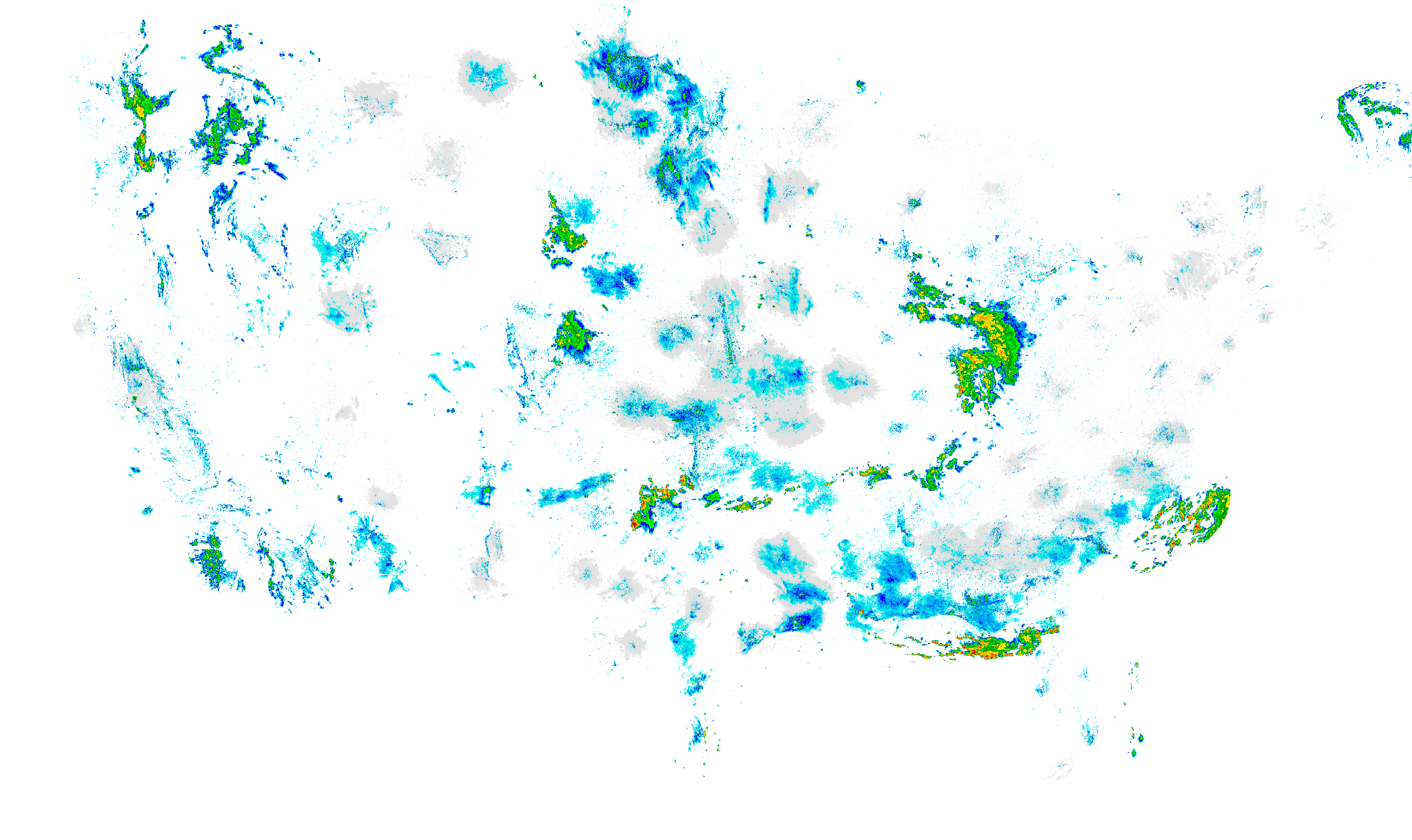
Step 2: Change The Palette
Changing the palette was more straightforward though I'm sure there are much more elegant ways of getting this done. I ended up creating a map between the NWS rainbow palette and a palette of my own choosing and parsing the image pixel by pixel and transforming the RGB values based on the mapping. I used Pillow for image processing.
def change_palette(image, palette=purple_yellow_red):
      """Takes an image file and changes the palette"""

      name = image.split('.')[0].split('/')[-1]
      im = Image.open(image).convert("RGBA")

      pixels = im.load()

      for i in range(im.size[0]):
      for j in range(im.size[1]):
      if pixels[i, j] in nws_colors:
        pixels[i, j] = change_color(pixels[i, j], palette)

      filename = "gif/new_palette/%s.%s" % (name, "png")
      im.save(filename, "PNG")

      return filename
With 3,000 by 2,000 pixels per image and around 25 images per animated GIF, that's 50,000,000 color changes, making this the most computationally expensive step in the process. If there's a better way to do this, I'd love to hear about it!
Here's how we're looking with the new palette:
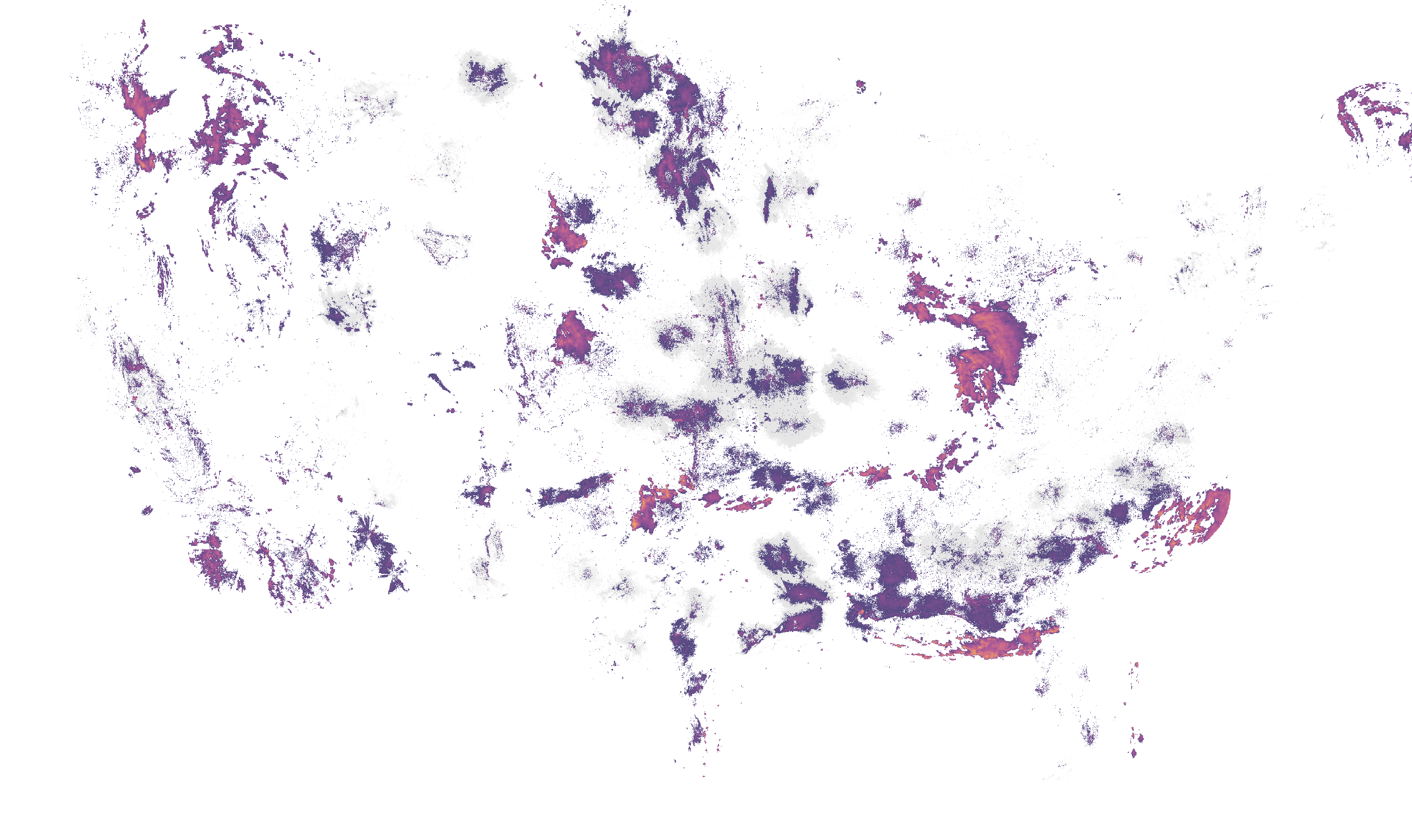
Step 3: Resize For Publication
I then resized the images to their display dimensions. I did this after changing the palette, even though it would have cut down processing time tremendously to do it the other way around, because it resulted in a higher quality image.
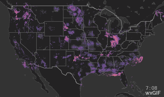
Step 4: Add A Basemap
Using Tilemill I created a high-contrast basemap. I initially experimented with more information dense basemaps by including elevation data and lakes and rivers before eventually deciding to go for simplicity.
I also added a timestamp and a small text logo using Pillow:
Step 5: Combine Images Into A GIF
Finally, it's time for the payoff!!
Using an awesome Python module I found floating around the web called images2gif.py, I was able to pass an array of radar images to a function that magically returned an animated GIF of my new and improved radar images.
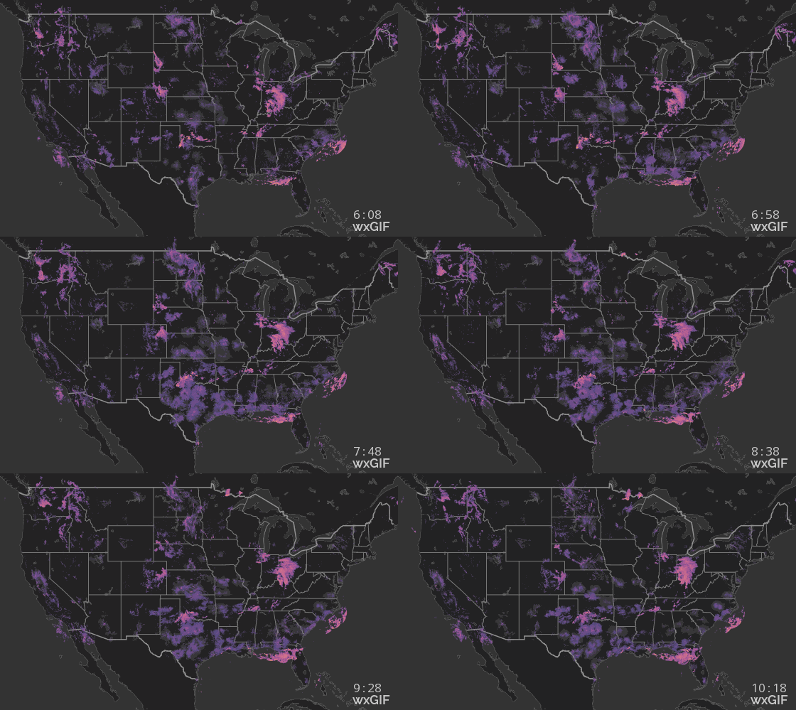
So voila! Here we have it, our final product:
Publishing To Twitter
I made this because I wanted an improved radar experience in my Twitter feed, so Twitter is where I've chosen to publish these images. This meant dealing with a few constraints.
At the time, Twitter didn't provide native video support, so that meant GIFs. Interestingly enough, Twitter converts GIFs to video on their platform. (While Twitter now supports video, they don't yet have a public API for uploading video, so GIFs are still the format of choice for auto-uploading animations.)
Further constraints include display dimensions (maximum width of 560px) and a maximum file size of 3MB. The more information dense images end up being larger in size, so to keep files under 3MB the script removes slides from the front-end of the animation until they fit under 3MB.
Creating A Bot Army
The National Weather Service groups radar imagery into 10 regions in the continental United States. In trying to balance file size and image quality, I found that it made sense for me to slice the national map into 14 regions. So counting the continental US radar, I needed to create 15 Twitter accounts.
Registering the accounts and providing my application with the proper permissions was the most arduous part of this whole process.
With Twitter accounts created and authentication keys in place, I pushed the project to Webfaction and created a cronjob that would run every two hours. The job would kick off scripts that download and process the data, generate the GIFs, and push them to Twitter.
Full List of Twitter Bots
@wxGIF
Continental US
@wxGIF_MidAtl
Mid-Atlantic
@wxGIF_Texas
Texas
@wxGIF_GulfCoast
Gulf Coast
@IntMtnWestWxGIF
Intermountain West
Interested?
You can view the code for this project on GitHub and if you like this sort of stuff, you should follow me on twitter.
Other Stuff By Matt
Mt. Mansfield Snow Depth
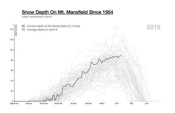
An interactive graphic that allows users to explore the snow depth on Mt. Mansfield for any season on record. This visualization was retweeted by Edward Tufte (who wrote the book on data visualization) and was shared by the Washington Post on their "Know More" blog.
Lyme On The Rise
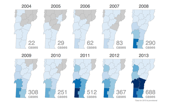
A data project for Vermont Public Radio on the growth of Lyme Disease over the last 15 years. Includes an interactive bar graph of New England and small multiples of Vermont and the continental United States showing the infection's expanded range. Published in the open with links to the data.
See the rest - matthewparrilla.com